Let’s reproduce the results of […].
Dataset
To load the dataset, we will use a R package that contains it, and then convert it to a Julia DataFrame. You will need a working R installation for that.
using RCall using TidierData using TDAmapper = R""" if (require("rrcov") == FALSE) { install.packages("rrcov") } library(rrcov) data("diabetes") diabetes """ |> rcopy;
┌ Warning: RCall.jl: Carregando pacotes exigidos: rrcov
│ Carregando pacotes exigidos: robustbase
│ Scalable Robust Estimators with High Breakdown Point (version 1.7-4)
│
└ @ RCall ~/.julia/packages/RCall/LWzAQ/src/io.jl:172
1
0.81
80
356
124
55
normal
2
0.95
97
289
117
76
normal
3
0.94
105
319
143
105
normal
4
1.04
90
356
199
108
normal
5
1.0
90
323
240
143
normal
6
0.76
86
381
157
165
normal
7
0.91
100
350
221
119
normal
8
1.1
85
301
186
105
normal
9
0.99
97
379
142
98
normal
10
0.78
97
296
131
94
normal
Now, let’s extract only the numeric columns
= @chain df begin @select (rw, fpg, glucose, insulin, sspg)Matrix end ;
and normalize them
function normalize (x)= std (x)if (std (x) ≈ 0 ) = 1 end .- mean (x)) ./ devend = mapslices (normalize, pre_X, dims = 1 )' |> Matrix;
Ball mapper
Now we calculate the ball mapper using all nodes, and setting \(\epsilon = 0.5\) :
= ball_mapper (X, [1 : size (X)[2 ];], ϵ = 0.5 );
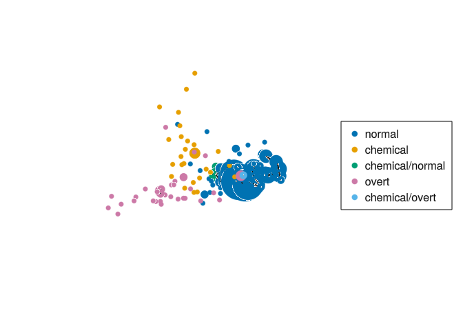
The resulting graph is the following
= node_colors (mp, df.group .|> string)= layout_mds (mp.CX, dim = 3 )mapper_plot (mp, node_values = node_values, node_positions = node_positions)
We colored each node by the most commom type of diabetes of the points in the node. We can see two branches coming from the center: one going left, with overt type diabetes, and another one going up, with chemical type diabetes.
